Is this really hard?
The ‘simple’ answer to that question is ‘It will be as hard as you make it.’ But that’s not really satisfactory, is it?
A Quick Example
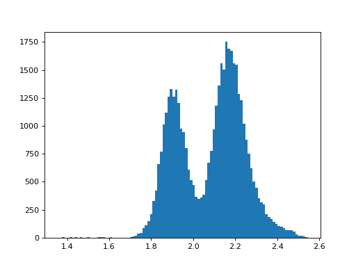
As another way to answer that question, let’s take a look at some real world data, and a simple Python analysis program. These data are a collection of crystallographically measured metal oxygen distances between 1.2 and 2.6 Å saved as a comma separated value (csv) text file. The ultimate goal is to make a histogram of these values, so that we can determine the average (and extreme) distances for different metal oxygen bond types.
Below are the first ten lines of the data file: the full
file is over 43,000 lines of unsorted bond distances.
 1Query, Refcode,DIST1
 23,VJYFILE,2.137
 33,HCO609K,2.097
 43,16QPMXS,2.142
 53,3G1AH85,2.138
 63,F92B1PE,2.106
 73,9M424BB,2.114
 83,3C4GPPI,2.068
 93,CIGZSJ5,2.321
103,E5F081S,2.192
A Python program that analyzes these data and its graphical output are shown below. We were able to accomplish our goal in 5 lines of code. Note: The plot shown here is not the exact output of this program. If you were to run this as a standalone program, the plot would open in an interactive window, with support for panning, zooming, saving, etc. (Don’t worry if the commands don’t make sense. That’s the point of reading this document!)
import numpy as np
import matplotlib.pyplot as plt
vals = np.loadtxt('MO.csv', delimiter=',', skiprows=1, usecols=(2,))
plt.hist(vals, bins=100)
plt.show()
(Source code, png, hires.png, pdf)

There. That wasn’t so bad, was it? If this seems like something you’d like to learn, then keep reading.
BONUS: Looking at this plot, approximate the average bond distances for metal oxygen single and double bonds?
Publication Quality Plot
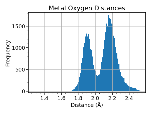
With some modifications, our simple plot can be made publication-ready as shown below.
(Source code, png, hires.png, pdf)
