Appendix B
This appendix contains some examples of common usage scenarios. In some cases, the code will be presented as it would be written in a Python program file. These can be run from the command line as follows:
datafolder>$ python program_file.py
In addition, these scripts can be run from the IPython interpreter by using
%run or by individually typing each line. See the IPython
instructions for more information. Little explanation is provided
here. See the documentation for detailed descriptions of the gcmstools
objects or any third-party packages.
Full Manual Processing Example
Below is an example script that does a complete analysis starting from loading
the files all the way through running a calibration and extracting
concentrations. This is approximately equivalent to what the function
data_proc is doing (see Batch Processing for a description that function).
This program is saved in the sample data folder under the name “full_manual.py”.
 1import os
 2
 3from gcmstools.filetypes import AiaFile
 4from gcmstools.reference import TxtReference
 5from gcmstools.fitting import Nnls
 6from gcmstools.datastore import GcmsStore
 7from gcmstools.calibration import Calibrate
 8
 9datafolder = 'data/'
10
11files = os.listdir(datafolder)
12cdfs = [os.path.join(datafolder, f) for f in files if f.endswith('CDF')]
13
14ref = TxtReference('ref_specs.txt')
15fit = Nnls()
16h5 = GcmsStore('data.h5')
17
18for cdf in cdfs:
19    data = AiaFile(cdf)
20    ref(data)
21    fit(data)
22    h5.append_gcms(data)
23h5.close()
24
25cal = Calibrate()
26cal.curvegen('calibration.csv')
27cal.datagen()
28cal.close()
29
30
A couple of notes. os.listdir is simply returning a list of all the files
that are contained in the folder defined by datafolder (“data/”).
Because that folder may have many different types of files, we need to do some
filtering. cdfs uses Python’s list comprehension to build up a list of
filenames that end with “CDF”. It also appends the datafolder path to the
beginning of the file name. This list comprehension syntax is a very compact
and efficient way to represent the following loop structure:
# The following for loop is equivalent to
# cdfs = [os.path.join(datafolder, f) for f in files if f.endswith('CDF')]
cdfs = []
for f in files:
    if f.endswith('CDF'):
        path_plus_name = os.path.join(datafolder, f)
        cdfs.append(path_plus_name)
Extracting Calibration Tables to Excel
It may be cumbersome to view calibration and concentration data directly from the HDF file. You can save any of the tables in the HDF file to an Excel format using Pandas’ to_excel function which is part of each DataFrame.
from gcmstools.datastore import GcmsStore

h5 = GcmsStore('data.h5')
h5.datacal.to_excel('datacal.xlsx',)
h5.close()
Keep in mind that these Excel files are not tied in any way to the original HDF file. If you change the calibration information or add new data, you’ll have to regenerate this file to see the new data.
Plotting a Mass Spectrum
You may want to be able to plot a mass spectrum from a GCMS file. This is fairly straightforward, but requires a few steps.
Step 1
First read in your file. This can be done directly:
In : from gcmstools.filetypes import AiaFile

In : data = AiaFile('datasample1.CDF')
Building: datasample1.CDF'
Or by reading out a data file from a HDF storage file:
In : from gcmstools.datastore import GcmsStore

In : h5 = GcmsStore('data.h5')

In : data = h5.extract_gcms('datasample1')
Step 2: Optional
Plot the total ion chromatogram to find the elution time for the peak of interest. This is only necessary if you don’t already know the time.
In : import matplotlib.pyplot as plt

In : plt.plot(data.times, data.tic)
Out :
[<matplotlib.lines.Line2D at 0x7f34>]

In: plt.show()
Hover the mouse over the peak you want. Somewhere at the bottom on the window, it should display the x and y coordinates of the cursor. Note the x number, and close the plot window. You don’t need to know the number to every last digit of precision – a rough approximation will probably get you close.
Step 3
Now you can find the array index that corresponds to that time. All GCMS file
objects define an index function to help you with this. The first argument
of the index function is the array to index. After that you can put one or
more numbers. For a single input number, a single index will be returned. For
several values, a list of indices will be returned. In “datasample1.CDF”,
octane elutes at approximately 7.16 minutes.
In : idx = data.index(data.times, 7.16)

In : idx
Out: 1311
Step 4
Now we are ready to plot the data. The GmsFile.intensity attribute is a 2D
array of all the measured MS intensities at every time point. Its shape is
(number of time points, number of masses). We can use our time index to select
a certain time. We’ll make this a box plot, which is more typical for this
type of data. (You only need to import Matplotlib if you haven’t done it
before.)
In : import matplotlib.pyplot as plt

In : plt.bar(data.masses, data.intensity[idx])
Out: <Container object of 462 artists>

In : plt.show()
You should see something like the plot in Figure 4.
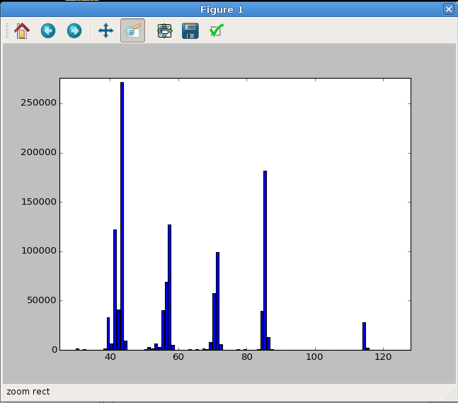
Fig. 4 The MS of octane plotted from our sample data set. In this case, the plot was zoomed in a bit to highlight the relevant data region. Your initial plot may look different.
Plotting Data and Reference MS
Let’s say you want to compare the reference MS with your data set. This can be done in much the same manner as before but with a couple of extra steps. We’ll use ‘benzene’ as our reference compound of choice.
Step 1
Get your referenced MS data.
In : from gcmstools.filetypes import AiaFile

In : from gcmstools.reference import TxtReference

In : data = AiaFile('datasample1.CDF')
Building: datasample1.CDF'

In : ref = TxtReference('ref_specs.txt')

In : ref(data)
Referencing: datasample1.CDF
Or from the HDF file.
In : from gcmstools.datastore import GcmsStore

In : h5 = GcmsStore('data.h5')

In : data = h5.extract_gcms('datasample1.CDF')
Step 2
Get the time index as shown above. Benzene elutes at 3.07 minutes.
In : idx = data.index(data.times, 3.07)

In : idx
Out: 553
You’ll also need an index for the reference compound.
In : refidx = data.ref_cpds.index('benzene')

In : refidx
Out: 0
Step 3
The reference MS are stored in the ref_array variable. This is also a 2D
numerical array with the shape of (number of ref compounds, number of masses),
so indices can be selected in the same manner as before. However, these data
are normalized, and the sample data will be much larger. We can easily
normalize the data spectrum.
In : normdata = data.intensity[idx]/data.intensity[idx].max()
Import Matplotlib for plotting before doing anything else.
In : import matplotlib.pyplot as plt
Side-by-Side Plot
Here we’ll do a side-by-side plot. By default, each bar will take up all of the space between each x-axis point (1.0 in this case), so we need to make the bars narrower otherwise the second bar plot will overlap. In addition, the x-axis for the second data set must be adjusted so the bars start at slightly adjusted positions. We’ll also change the face color (“fc”) otherwise they will be the same for both. In this case, we’ll use the same adjustment as the width of the bars. The resulting plot is show in Figure 5.
In : plt.bar(data.masses, normdata, width=0.5, fc='b')
Out: <Container object of 462 artists>

In : plt.bar(data.masses+0.5, data.ref_array[refidx], width=0.5, fc='r')
Out: <Container object of 462 artists>

In : plt.show()
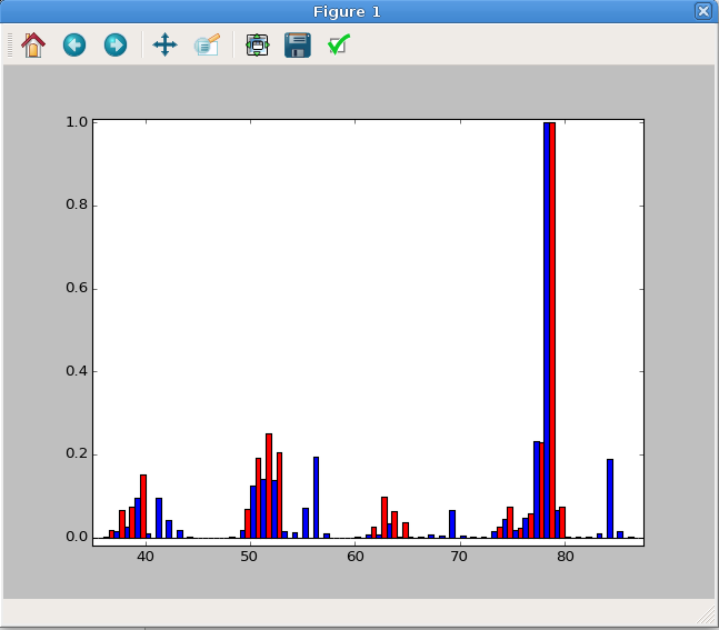
Fig. 5 A side-by-side MS plot. This has been zoomed in to highlight the important data region.
Up-Down Plot
As an alternative, you could plot one of the data sets upside down, which may
have some utility. Notice, we just need to invert (-) one of the intensity
data sets. The resulting plot is shown in Figure 6.
In : plt.bar(data.masses, normdata, fc='b')
Out: <Container object of 462 artists>

In : plt.bar(data.masses+0.5, -data.ref_array[refidx], fc='r')
Out: <Container object of 462 artists>

In : plt.show()
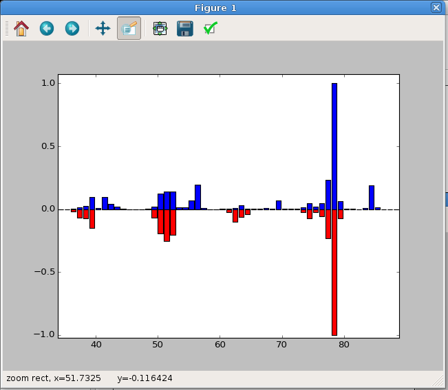
Fig. 6 A Up-Down MS plot. This has been zoomed in to highlight the important data region.
Difference Plot
To plot the difference between the data and the reference, just subtract one spectrum form the other. The resulting plot is shown in Figure 7.
In : diff = normdata - data.ref_array[refidx]

In : plt.bar(data.masses, diff)
Out: <Container object of 462 artists>

In : plt.show()
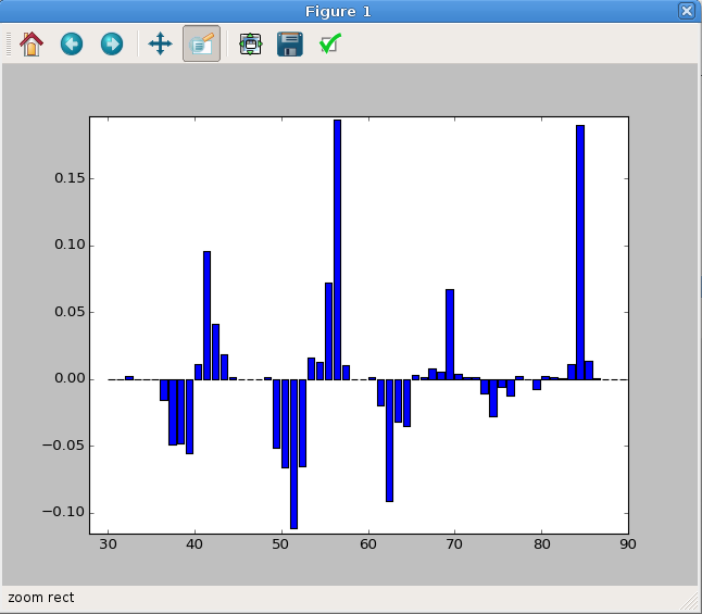
Fig. 7 A difference mass spectrum plot. This has been zoomed in to highlight the important data region.
Plotting Data and Fitted MS
You may want to plot a mass spectrum relative to the fitted spectrum for one particular reference compound. This can be done in a very similar manner as above, but we must first fit our data. This will follow the side-by-side reference plotting section, check there to find out how to set some of these variables. Again, we’ll use ‘benzene’ as our test case.
In : from gcmstools.fitting import Nnls

In : fit = Nnls()

In : fit(data)
Fitting: datasample1.CDF
Bar Plot
In this case, we need to do a little Numpy index magic. Remember that the
fitting generate a fit_coef array. These are the least-squares
coefficients at every data point. This is a 2D array with shape (# of time
points, # of reference compounds). We will use our time index (idx) and
our reference index (refidx) to select out one least-squares coefficient
and then multiply this by our reference mass spectrum. The final plot window
is shown in Figure 8.
In : fitspec = data.fit_coef[idx, refidx]*data.ref_array[refidx]

In : plt.bar(data.masses, data.intensity[idx], width=0.5, fc='b')
Out: <Container object of 462 artists>

In : plt.bar(data.masses+0.5, fitspec, width=0.5, fc='r')
Out: <Container object of 462 artists>

In : plt.show()
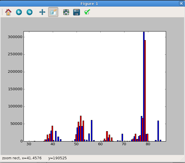
Fig. 8 A side-by-side MS plot of the sample data versus the fitted data for benzene. This has been zoomed in to highlight the important data region.
Dot Plot
Alternatively, this comparison can be done with a standard plot, as long as
the markers are set to be large dots ('o'). A perfect correlation would be
a straight line. We can show this by plotting the sample data against itself
as a solid black line ('k-'). This plot window is shown in Figure
9.
In : fitspec = data.fit_coef[idx, refidx]*data.ref_array[refidx]

In : plt.plot(data.intensity[idx], fitspec, 'o')
[<matplotlib.lines.Line2D at 0x7f34>]

In : plt.plot(data.intensity[idx], data.intensity[idx], 'k-')
[<matplotlib.lines.Line2D at 0x7f34>]

In : plt.show()
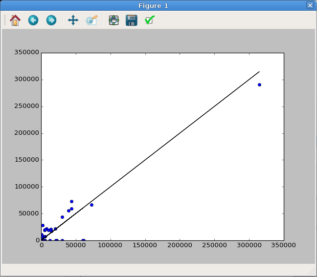
Fig. 9 A dot plot comparing the sample data versus the fitted data for benzene. A perfectly straight line (black) indicates a perfect fit.
Fancy Data Versus Fit MS Plot
This example will be very similar to the Data vs Fit plots above; however, we will use a fully process HDF storage file to get our data set. This will be presented as a complete script. A copy of which, called “fancy_ms.py”, is contained in the sample data folder along with a copy of the PDF output (“fancy_ms.pdf”). A picture of the resulting plot is shown in Figure 10.
 1import matplotlib.pyplot as plt
 2
 3from gcmstools.datastore import GcmsStore
 4
 5h5 = GcmsStore('data.h5')
 6data = h5.extract_gcms('data1')
 7h5.close()
 8
 9refcpd = 'benzene'
10refidx = data.ref_cpds.index(refcpd)
11
12time = 3.07
13idx = data.index(data.times, time)
14
15fitspec = data.fit_coef[idx, refidx]*data.ref_array[refidx]
16dataspec = data.intensity[idx]
17
18### This is all the plotting stuff
19
20plt.figure(figsize=(10,4))
21
22plt.bar(data.masses, dataspec, width=0.5, fc='b', label="Sample")
23plt.bar(data.masses+0.5, fitspec, width=0.5, fc='r', label="Fit")
24plt.grid()
25
26plt.xlim(30, 90)
27plt.xlabel('m/z')
28# Don't show the y-axis ticks
29plt.tick_params(axis='y', labelleft=False)
30plt.title('Benzene Mass Spectra')
31
32plt.tight_layout()
33# We can save files in PDF format, which gives them unlimited resolution.
34plt.savefig('fancy_ms.pdf')
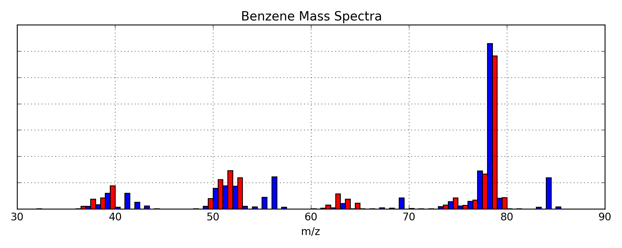
Fig. 10 A fancy plot comparing the sample data (blue) and the fitted data (red) for benzene. The PDF version is a vector graphic, so it has unlimited resolution.